
The Systematic Use of Color Psychology in Game Atmosphere Design: Warm vs. Cool
Color is the silent architect of a game's emotional landscape. From the angry reds of battle to the isolating blues of dread, here's how developers use color psychology to shape your experience.
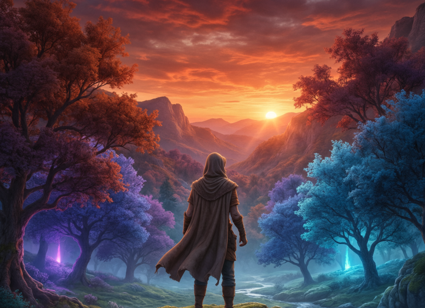
More Than Just an Aesthetic
You walk into a room. The walls are painted a deep, bloody red. You feel alert, maybe even a little on edge. You step into another room, this one bathed in a cool, icy blue. Your heart rate slows. A sense of calm — or perhaps eerie isolation — washes over you.
This is the power of color. In video games, it's one of the most potent tools a designer has for shaping a player's experience, often without them even realising it. While conversations tend to focus on narrative, gameplay mechanics, and graphical fidelity, the deliberate use of color psychology is the silent architect of a game's emotional landscape.
Color in games is far more than decoration. It's a functional language that communicates with the player on a subconscious level. Research consistently shows that correctly selected colours emphasise the theme and mood of the game, immersing the player in the atmosphere. Colour can affect a player's perception of size, speed, and even the complexity of a game object.
This is why a simple red barrel in a first-person shooter signals "explosive" to a player instantly, without a single word of text. It's a visual shorthand that relies on learned colour associations to convey crucial gameplay information quickly and efficiently.
The emotional and physiological impact of colour is a key element of this communication. Warm colours like red, orange, and yellow are stimulating. They can excite and energise players, making them feel more alert and engaged. This is why these colours often dominate in high-action games, during combat encounters, or in environments meant to feel hostile and dangerous.
A 2008 study published in CyberPsychology & Behavior investigated the impact of simulated warm (reddish) and cool (bluish) lighting in a game world. The study found that players performed best and fastest in a game world lit with warm lighting compared to cool lighting. Furthermore, warm lighting was shown to induce the highest level of "pleasantness" in players, which in turn appeared to enhance their performance. A 2025 study using EEG-VR technology also found that colour can induce emotion in a targeted manner, and that illumination and colour temperature can synergistically reduce cognitive load, making the experience smoother and more engaging.
The Duality of Warm and Cool
The fundamental distinction in game design often comes down to the battle between warm and cool colour palettes, each serving a specific narrative and emotional purpose.
The Heat of Action: Warm Colors
Warm colours are often associated with energy, danger, passion, and aggression. In a study of Hideo Kojima's Death Stranding, researchers used computational image analysis to map the game's visual language. The findings revealed a clear strategy: while cool colours (blue/grey) were used to symbolise isolation and uncertainty, warm (amber/orange) colour codes were strategically deployed to symbolise connection and hope. This demonstrates how even within a single game, warm colours can be used as a beacon of relief or a moment of emotional respite against a backdrop of oppressive coolness.
This principle extends to the games we play. In the real-time strategy classic Red Alert, the Soviet faction is heavily steeped in red — a colour that conveys aggression, power, and urgency. Similarly, in puzzle games like Portal, the sterile, cool environment of the Aperture Science labs is punctuated by the warm, orange portals. This creates a stark visual contrast that guides the player's eye and signals a "point of interaction," providing a moment of clarity in an otherwise clinical, unfeeling space.
The Chill of Isolation: Cool Colors
Cool colours, such as blue, green, and purple, typically have the opposite effect. They are calming, relaxing, and can be used to evoke feelings of sadness, isolation, or mystery.
A game that uses cold colours effectively is Inside by Playdead. The entire world is rendered in a bleak, monochromatic palette of greys, deep blues, and muted browns. There is almost no warmth to be found. This oppressive visual aesthetic is central to the game's atmosphere of hopelessness, dread, and quiet desperation. It's hard to imagine the game having the same emotional impact if the world were saturated in vibrant colours.
Systematic Application in Practice
The most sophisticated game developers don't just pick colours — they design comprehensive systems. A prime example is the game Veil of Madness, where colour and lighting are treated as a "binary narrative" to convey the central theme of a duality between hope and decay. The game's artists deliberately manipulate the viewer's emotions by showing scenes that contain both the warmth of a gentle glow and the cold, intrusive chill of an unsettling environment.
The design philosophy of Arknights: Endfield offers another compelling case study. Described as an "introverted beauty," the game moves away from the highly saturated, eye-catching palettes common in its genre. Instead, it uses a "natural and introverted" approach, prioritising "depersonalization and decoupling" and employing a "soft, low-contrast aesthetic" that feels more grounded and mature. This makes the experience feel less like a stylised fantasy and more like a tangible world.
This isn't just about making a game look different. It's a design choice that also serves a functional purpose. By using a "clean," un-stylised base, the developers can apply complex lighting and environmental effects without creating "style conflict," allowing for more immersive weather systems and atmospheric changes.
Conclusion
The systematic use of colour psychology in games is a testament to the maturity of the medium. It is a powerful form of non-verbal communication that operates on a primal level, shaping a player's mood, directing their attention, and reinforcing the game's narrative themes. From the angry reds of a battlefield to the hopeful amber glow of a distant fire, game designers are creating worlds that don't just look beautiful, but feel profound. They are, in effect, mastering the art of painting with emotion.
Explore on Olgjoy Games
Ready to play? Browse free HTML5 games or read more guides.
More to read
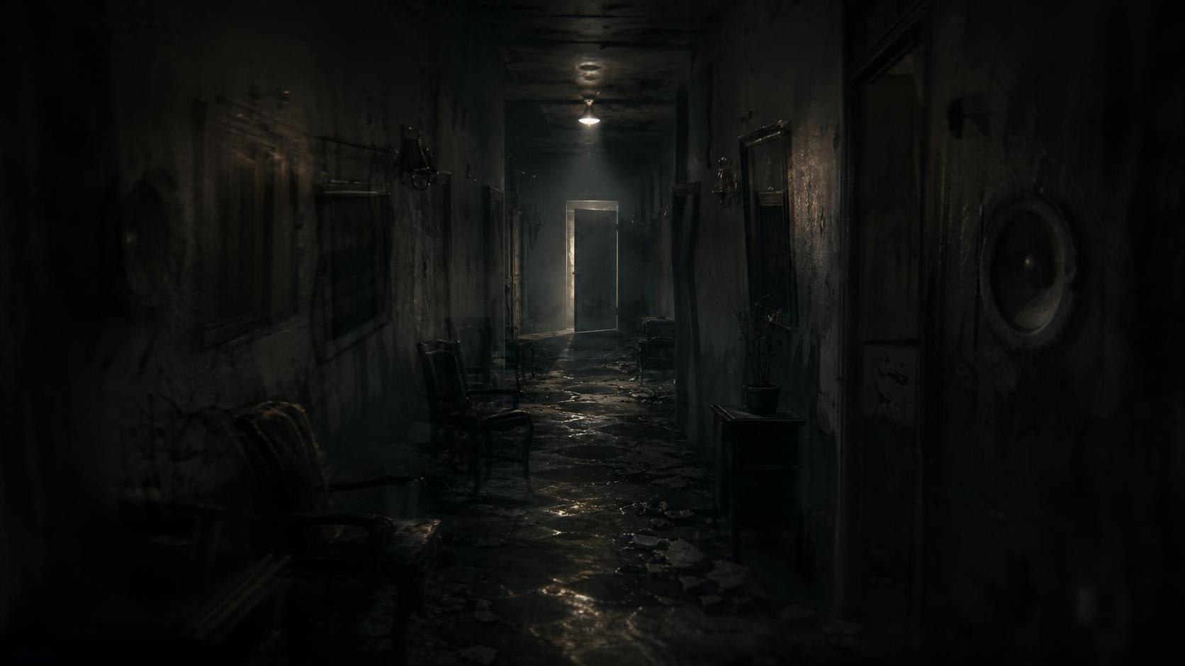
How Horror Games Are Using Sound Tricks and Visual Lies to Mess With Your Head
The most terrifying games today don't just make you jump — they make you question everything you hear and see. Audio puns and environmental misdirection are becoming the foundation of modern fear.
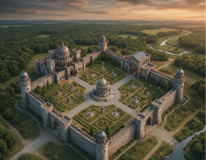
Retro Turn-Based Tactics: Innovation and Compromise in Modern Design
Developers keep going back to the 1990s for inspiration, but they're not just copying — they're adapting. Here's what works, what doesn't, and what the next decade holds for the genre.

Interactive Dynamic Music Systems: How Game Scores Adapt to Your Every Move
From vertical layering to horizontal resequencing, adaptive game music has quietly become one of the most sophisticated systems in modern game design. Here's how it works.
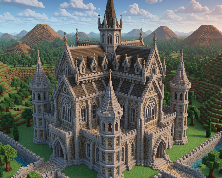
The evolution of building styles in games: from the practicality of pixel blocks to the pursuit of purely decorative aesthetics
From crude pixel blocks to sprawling photo-realistic cities, the evolution of video game architecture tells a story about technology, ambition, and how we connect with virtual worlds.